The good and the bad of GPlates
Two approaches to drama and how they apply to maps
It seems that there is an amount of pride that comes with having a representation of your setting that doesn’t look like the equivalent of a nursery-age pirate’s treasure map. This may explain the increasing popularity of the ‘satellite’-style and the topographic aesthetics in communities like the mapmaking subreddit. This may be emblematic of a shift in the wider approach to alternate-world fiction. I am, of course, no stranger to this. Some part of me looks at a map of Middle Earth and sees the weirdly angular enclosure of mountains surrounding Mordor and frowns. The modern day darling of worldbuilding, Stephen Erikson, is highly educated in anthropology. And it damn well shows. For anything vaguely anthropology-adjacent, there’s some clearly informed thought going on there. But look at a map of that world. The continents are basically glorified rectangles. I’m no geoscientist, but that world map to me reads like a bunch of different maps drawn at different times for different purposes, without much thought, and loosely grouped together after the fact. And that would make sense given that the Malazan series is, as I understand it, basically the novelisation of an epic-level DnD campaign… How about Warhammer’s Fantasy’s Ulthuan, with it’s weird donut of land and a whirlpool in the centre. That particular construction has always had a draw for mapmakers – I guess there’s a bit of the human brain that really likes circles and thus are drawn to atolls. Atolls are ring-shaped islands around a lagoon that was, once upon a time, a volcano. That’s, of course, wildly simplified, and there’s also the ‘antecedent karst model’ to explain atolls, but this isn’t about atolls, so you’re going to have to look into that whole thing on your own. And there are countless other examples across countless other settings.
This doesn’t make those maps bad. It more reflects the fact that mapmakers scratching their heads over tectonic plates is very very recent. Prior to the Internet, other idiots like us scrawling stupid shapes around puddles of rice:
- Had no need to think about how scientific everything was – they weren’t designing these maps in the modern era where everyone on Reddit was screaming about split rivers and the exact mineral content of soil in which to grow specific breeds of parsnip, and you can’t have those guys growing those parsnips in that place, because they’re fifteen degrees north of the equator, and….
- They were drawing maps that fit a theme or purpose, not to fit the scientific consensus. Mordor looks like that because Tolkien needs a fortress – not just a man made one, but a natural one. Particularly, one you can’t knock down with a couple of Ents throwing a temper tantrum.
- Didn’t have all the information that we can access at a whim in the modern age. Blokes like Tolkien would have looked at enough maps of Scandinavia and had enough mates at prestigious universities and so on, to figure out whether or not their continents looked a bit off and so on. Whether he cared was his concern. Realistically speaking, other authors from less advantaged backgrounds almost certainly wouldn’t have had access to that kind of information and education. They would have worked with what they had, which may not have been a great deal.
Still, getting a map that looks at least halfway decent can lend to a sense of verisimilitude, both for the author and for the audience. Get it right and you will have something that makes more sense at a glance than the average conworld. There’s a couple of different approaches to the practicalities here. I can only approach this from a narrative perspective, but you can extrapolate across other mediums.
The first kind places the emphasis on drama: If it takes half a year for the army to march north from The City to fight the barbarians because that fits the narrative, then it takes half a year. If it takes them ten days to march back from The North to The City just in time to save the day from the Insidious Plot of Charles the Wheelwright, then it takes them 10 days. because the story demands it, and time is the mistress of the keystones of narrative demand. If your drama works better with a floating island, then you’d better believe there’s an island in the sky, and that author doesn’t feel compelled to explain why it’s up there or how it’s defying the laws of physics despite everything else in the setting obeying them. Main character? Gravity’s bitch. Random chunk of rock? Gravity didn’t see nothing, sorry can’t help you.
The second kind places the emphasis on groundedness: You might say this philosophy is more in line with the naturalist philosophy of writers like Honore de Balzac and Gustave Flaubert. It treats narrative as a series of events that should reflect reality, should adhere to a set of deterministic rules. Now it might be a bit of a reach, but run with me here: if you want your narrative to follow a relatively deterministic path, then you should be deterministic with the setting. And if that scientific determinism is applied to the setting, then you’d try to make a world in which one action and or event or element flows from one to another in a rational fashion. No floating islands, unless you can figure out how you’d keep them in the sky for the long term and what happens if one of those floating islands falls out of the sky, and how messing about with fundamental forces of nature raises extremely difficult questions that apply to the rest of the setting. It’s deliberately bitch-slapping the ‘a wizard did it’ excuse.
For the people who want to mess around with tectonic plates, you can bet they’re in the latter camp. They’ll opt for Balzac over Proust, they might prefer depictions of the ordinary themes of ambiguity, over a focus on idealistic depictions of passion, honour, love and other nebulous bit of the “human condition”. If it took the half a year to walk north to fight the barbarians, then it takes them half a year to walk back. The drama stems from the expenditure of time, as a resource, the protagonist’s inability to impact the plot while they are tramping across Your Mum’s Mounds, and the subversion of those archetypal narrative expectations that allow the hero to show up just in the nick of time to kill the dragon, save the kingdom, and shag the princess.
In some ways you could view this as the cartographer’s equivalent of conlanging. Sure, when most authors need something that isn’t ‘Dave’ or ‘Susan’ they usually just slam their faces into the keyboard, Star Trek style, or tweak some existing names, GRRM style. The hardcore conlangers, however, aren’t about that beta bitch life. They start with labial fricatives and post-alveolar stops, and only get more dense from there.
Climbing towards a distant peak
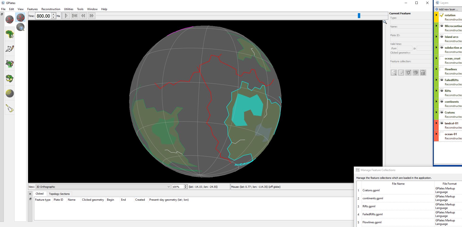
If you really want to get plate tectonics right, then GPlates is your stop. I’ve looked around, and as far as I can tell, there isn’t anything else that does this. There certainly isn’t a user-friendly casual version of this application that isn’t aimed at geologists. The fact that this exists at all, and allows mega nerds to do mega nerd things, is pretty cool, in all honesty.
There’s also a certain unexpected meditative quality to the process. It’s weirdly calming, the way doing the dishes or taking a shower can be. Once you have some kind of idea of how the basic process goes, you can just get on with it and think about other things for a half hour. Stick an asterisk in that statement.
As you might expect from an application centred on data, there’s a lot of detail. If you are concerned as to whether you’ve got the right amount of land coverage – about 25% of the total space of your globe – you can measure it, or take the area metric, and run a calculation on the scientific setting of your calculator app to get an exact reading on what percentage of your landmass is covered. If you want to know how far your continents have moved every increment, and you’re dead set on keeping it at the right amount, there’s an, actually kind of cool, little gizmo for that. It will check, per movement, how fast your chunks of land are moving, so you’re not just making the Sonic of tectonics. This is particularly relevant if you are concerned with whether your orogeny is accurate to the circumstances in which it occurred and follows the relevant type – Laramide, Andean, Ural, Himalayan. The measuring tool is very helpful in this instance, because you’re measuring belts of orogeny in comparatively thin bands at times, and trying to eyeball ~100 km on something like Illustrator, unless you’ve got a pretty fine-tuned scale going on, is going to be time-consuming and difficult. And orogeny is a big part of the process, because you need to know where your mountains are so you can throw down your major rivers and your major rivers dictate most of your settlements, and what’s getting the most water, which you can infer some kind of terrain from, and so on and so forth. So if you really want to get those mountains and valleys accurate, then GPlates has you covered down to the nth degree. Or maybe you’re Hidetaka Miyazaki, and everything is a hell swamp. Your choice.
One perspective I am interested to test is whether mapmaking in a procedural fashion might break you out of your mould and throw up some things you hadn’t considered before. At best most of us are just throwing down haphazard lines and calling it a day. If we bother with tectonics, we looked into it for a half hour, and thought it was interesting but probably beyond us. Even if you belong to the elite class who decided to read a whole Wikipedia article, you didn’t start from scratch. Shut up – I see you. You can’t lie to me. You just decided you’ll start putting down some other lines beneath the mountain ridges you already fat-fingered into your pasta map years ago, so you can “scientifically” justify your knock-off Himalayas. You figured that the chances are, despite potential improbabilities of a mountain ever actually occurring in the place you put it, etc – that you’re never going to get called out by a geoscientist or even remember that you’ve done all of this weird tectonic bollocks in a week anyway. So who cares? Well, here’s the thing, you charlatan…. You’re exactly correct. It makes sense to do that.
On the other hand, the way we draw things are more about aesthetic inbuilt models, and questionable heuristics for how we think something should probably be. We just gut-feeling our way through it, but maybe about 1% of us actually have any real idea about any of this stuff. So, gut-feeling our way through, or “here’s a mountain range in the shape of a pony because I think it’s cute uWu”, is a just going to result in maps that look unnatural – even if we are trying to do something authentic. For instance, I like big arcing coastlines and cove-looking things. No idea why, I guess it goes back to that thing I said about atolls a thousand words ago. If you ask me to draw a map off the top of my head, you’ll probably end up with something that looks like I grabbed a pen and went at a hunk of swiss cheese that someone was mid-way through nibbling on. Also, I’m inadvertently applying a micro-level landscape feature to a macro-scale landmass. It doesn’t make sense, but it’s just where my inherent biases take me. And following my own unconscious heuristics is likely to result in me just making variations on the same thing over and over again. But mapmaking in this kind of bit-by-bit procedural style, might throw up some other shapes and disrupt our own internal narratives around whatever weird unconscious idea we might have of what bits of continent should look like. That’s not a sentence I anticipated writing in my lifetime, but here we are.
A rift with the process
So what’s the problem, then? If this program is so good and we should be going out of our way to break our own internal models, then why not just write: ‘it gud, download noa, plz’. Well, because it isn’t. At least, not for non-scientists. Or at least that was my experience. Your millage may vary. Again, if you’re not doing geoscience things, then this program wasn’t actually built for you.
After about 300 million years, which isn’t remotely as long as it sounds, I wanted to split a chunk of continent into two. So I made a rift and reset the other failed rifts and redrew the two separate halves of the continent, and gave them all the IDs and dates and changed all the dates and names of the previous continents and rifts and then I relinked things to cratons, and then I opened up notepad++ and the co-ordinates, and added the two lines to the 4th craton section and reloaded the rotation file and… And half the continent jumped half the world away.
This happened because GPlates reads things back to front so it was counting the co-ordinates as where it thought the crust should be when it stopped following craton A, not where they were at the time that it did stop following craton A… So I went back and spent 5 minutes looking at notepad++ and figured out my problem and swapped the things around, reloaded the rotation file. It worked, one part of the plate was doing what I wanted it to do. Hell yeah, learning, baby! Accomplishment! Endorphins! Dopamine!
Stop.
You remember how I said the process can be calming a few paragraphs ago? Here’s that asterisk: it’s calming until it’s not. Like most programs of this arcane calibre, it’s not exactly drag and drop.
I tried to move the other bit to make sure I’d hooked it up correctly, and, sure enough, I’d missed something somewhere. Suddenly I had the continent that I’d rifted attached to the half the continent I wanted to move. For some reason the initial continent wasn’t disappearing as it should have, and because this was all happening to the first continental piece I’d drawn, I don’t think I had anything in the rotation file to tell it to follow anything. In theory, it should have just disappeared and the new bit of continent should have replaced the old one and I could get on with things. Instead, what I got was a continent that didn’t want to despawn, and then wanted to throw itself across the map and rotate in some way I hadn’t told it to. I can only assume that it was probably reading a set of co-ordinates in the rotation file and thought that whatever they were was the “logical” next step.
Does that all sound like mind-numbing insanity to you? Because around this point I threw my hands up and walked away.
Now, what I could have done, was just go back to video two or three or whatever, and try to follow along and figure out what I’d missed. And honestly I could have done that with relatively minimal hassle. On the other hand, at this point I’d been messing around with GPlates for 3 days, and the ratio of useful progress to faffing around with minutia and trying to get the program to interpret what I wanted it to do, was borderline unethical. The problem wasn’t the overly attached continent.
I realised that the confusion, slight frustration and tedium that I was feeling in that moment were only going to compound as the test project got further and further along. The problem was that I was in the very early stages of a process that promised to become infinitely more complicated in the future, which would in turn make the problems infinitely more complicated and time-consuming. Do you see where I’m going with this?
And this is without bothering with oceanic crust. If you watch a couple of the Artifexian videos, you can look at the time stamps and see that, very quickly, all of the oceanic crust and flowlines stuff takes up massive chunks of video time. Even sped up.
If landmasses are time consuming and confusing, the oceanic tectonics is an inevitable insanity that is an entirely new level of confounding lunacy that I want no part of and cannot see a use for. It’s a longwinded convoluted mess of connecting dots that form into a rolling succession of rectangles. Every time you move a plate, you draw a new series of rectangles, every time you rift a plate, you get new rectangles to draw, until you’ve got oceanic crust meeting in at least three places and you need to do a long chain of convoluted things in order to make the rectangles connect in the right way.
This is bad enough before you consider that the lines of oceanic crust also have to follow the flow lines. If they’re overlapping and look weird, you’re doing something wrong. Sounds simple, but when you’re throwing things around curves, which you will be doing for various reasons, it is not long before those lines start running into each other. Finally, when Artifexian starts dealing with oceanic subduction zones, he starts needing to treat the bits of oceanic crust as separate entities. This requires redrawing sections over entirely, doing a whole new bunch of incredibly convoluted steps with the data and the rotation files just so he can get everything to move where he wants it to move. Which is all to illustrate in great detail that, unless you’re in this for the scientific aspect the oceanic crust stuff will never amount to anything, and will take hours upon hours of tedious clicking and squinting at lines and vector points, and copying and pasting different chunks here, there, and everywhere, and trying to have flowlines between multiple landmasses not overlap and…
It’s an extreme amount of work for no payoff. I cannot for the life of me see a practical benefit to it. For the sake of my sanity, I ignored that whole mess, and saved myself literal hours. And again, I want to stress that this is all with a test file with less than half the number of initial moving parts.
Pattern fracture
If this all sounds a tad anal retentive – that’s because it bloody well is. If it were any less obscure and weird, it could at least be a contender for the dictionary definition of ‘pointlessly tedious nit-picky crap that nobody actually cares about except, like, a handful of blokes who desperately need to touch some grass’. But on the other hand, some of us don’t really know if we are in the esteemed handful of blokes that do really care about that sort of thing, and sometimes all it takes is a confrontation with the intentional misuse of a desperately unintuitive bit of academic data visualisation software to get us to go the fuck outside and remind ourselves that vitamin D tablets cannot replace the sun.

Leave a comment